Problem
Put managers in control and give them reliable data to make correct decisions – this was a general goal for Manager Panel. And since all reporting in “mother” call centre was done in Excel and required IT support a blank piece of paper was a starting point. So… where to start?
Design process(es)
The whole project was a big research and development process that involved hours of interviews, observations, analysis of documents or other artefacts. As a part of the team, I participated in agents training and tried selling products in telesales campaigns. All to see how different managers and their staff work and how is to be a part of such a team.
Different functionalities required separate approaches. Once benchmarking and competition research was a first thing to do. In a case of designing an analytics the interviews with managers were starting point. Sometimes wireframes were tested and sometimes wireframes were designed together with users.
UX designer toolbox
Research
Design areas
Tools
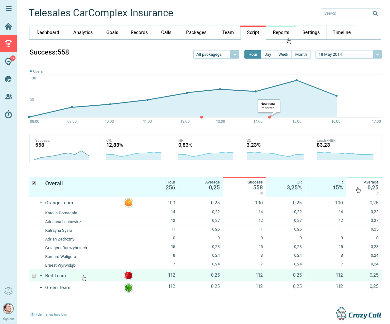
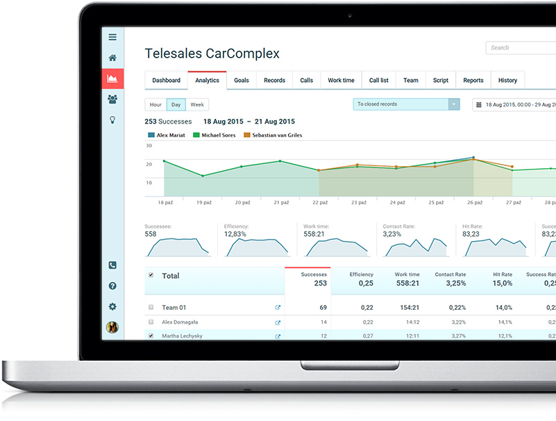
Analytics and Wizards
Analytics and couple of wizards were key features. We defined KPI’s with all possible ways how it can be measured and how different users handle this information. Scenarios and use cases were considered: for novice managers and those who understand perfectly changes in particular metrics. Also, grouping team statistics and dealing with changes to past events were solved.
Many ideas were not developed due to lower priories. Between things at the deep end of backlog are charts showing a speed of records consumption by agents, a tool for forecasts, sale goals and tool to distribution goals between teams and agents and much more.
Finding the best way to present data
I love data and charts. And so do managers. But… giving beautiful charts to managers is not a UX designer role. UX Designer goal is to understand how data are used, which data are required and when. Business and management are built upon KPIs – so my first goal was to get familiar with this values and ensure that all users understand them correctly (which quickly turned out that they often use the same indicator measured differently).
The second step was to provide a suitable graphic representation for different KPIs or data sets. Once showing line chart worked – for instance in analysing historical data, in other cases like agents goals progress bars were better. Also, some sets were analysed alone and others needed a comparison for making any decisions.
The most important thing was to indicate trends and to create a design that allows checking system (or a campaign) status in the blink of an eye. Are agents working? How is their efficiency? Is call-list good or bad? Data was the answer and decision about actions to undertake should be made upon data. What action? That was a separate story that involved BI and notifications.
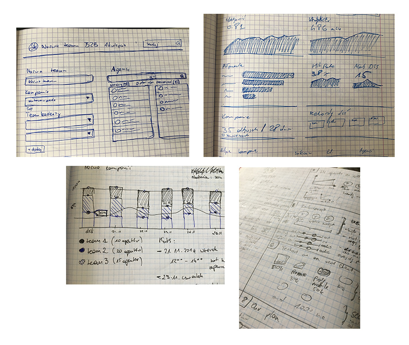
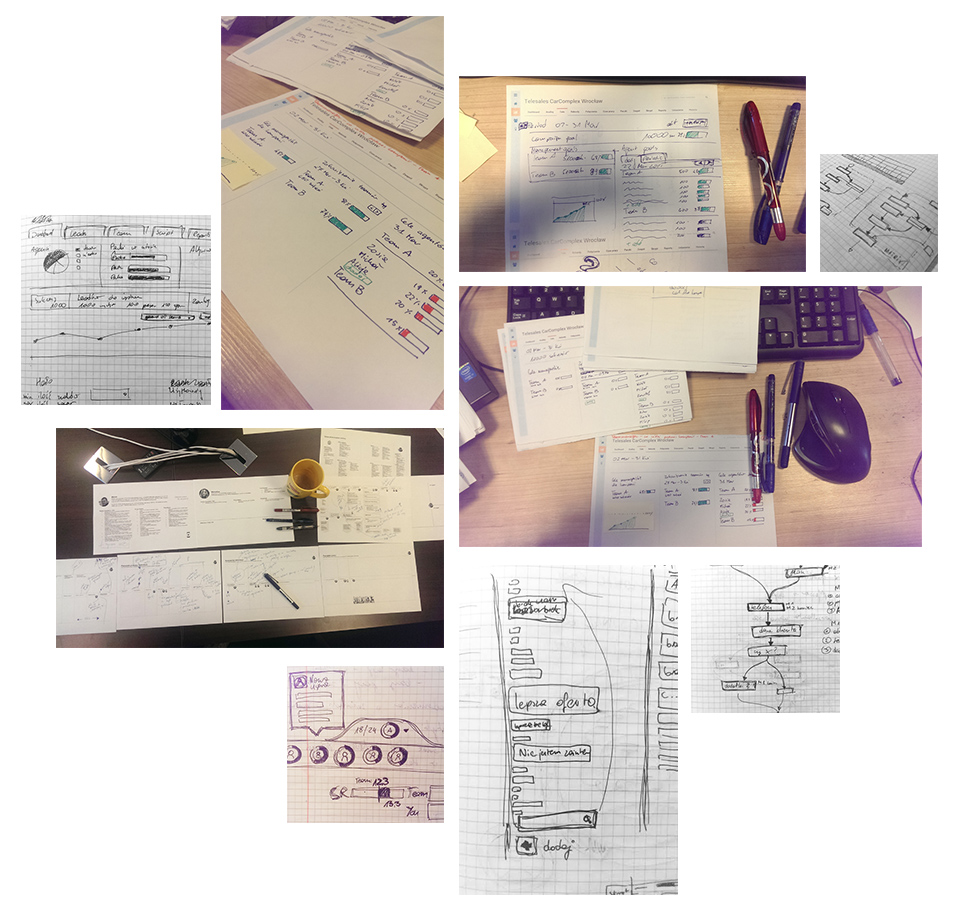
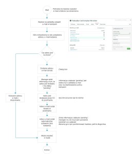
Wireframes and ideation
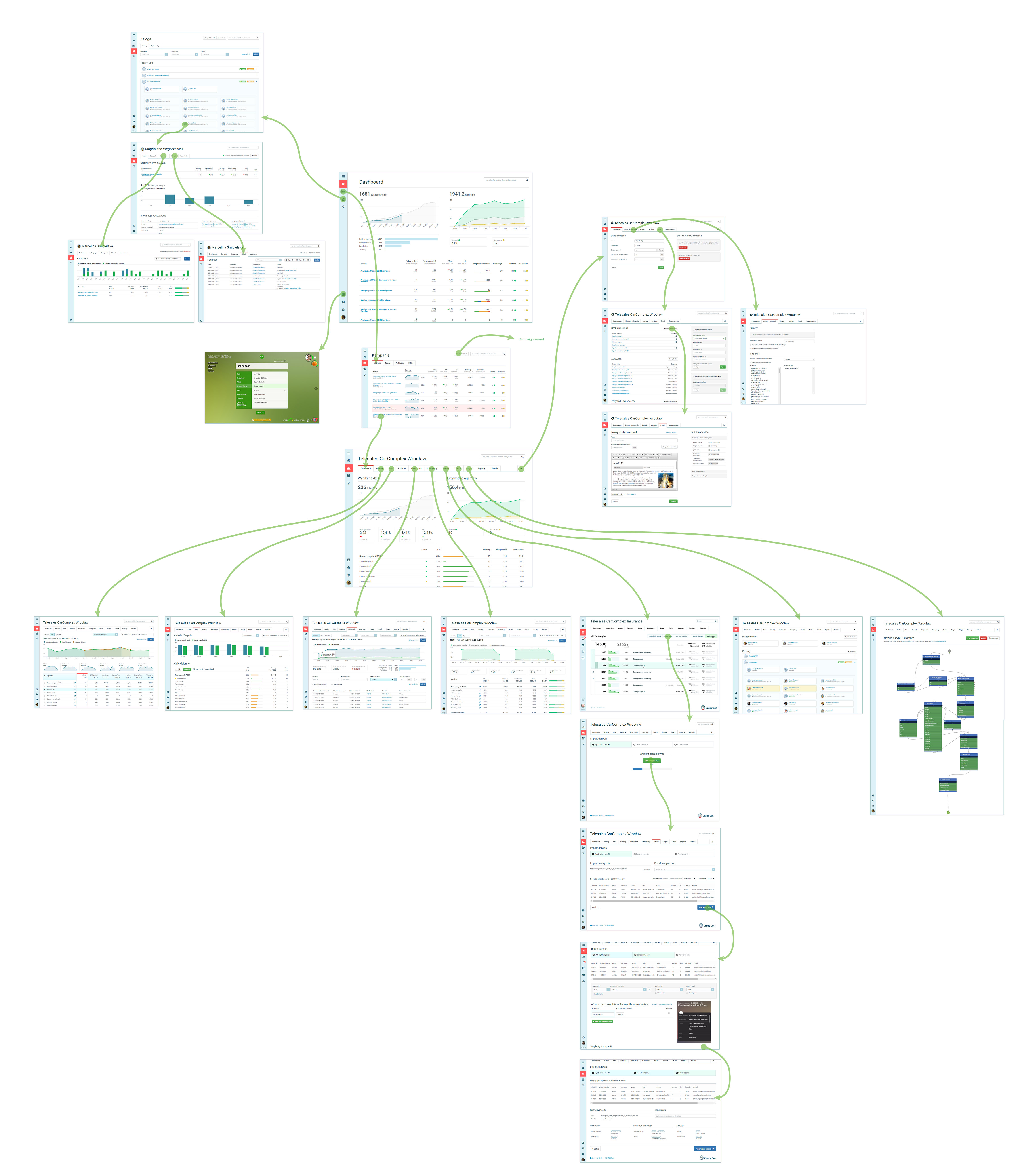
Each part of Manager Panel was, in fact, a separate development project. All needed to be coherent across the platform, but working on different parts was doing it all from scratch. Some parts required user flows and diagrams others were designed together with developers and some were only my ideas done on paper.
All, however, were used to validate ideas, navigation and to check if user goals were easy to accomplish.
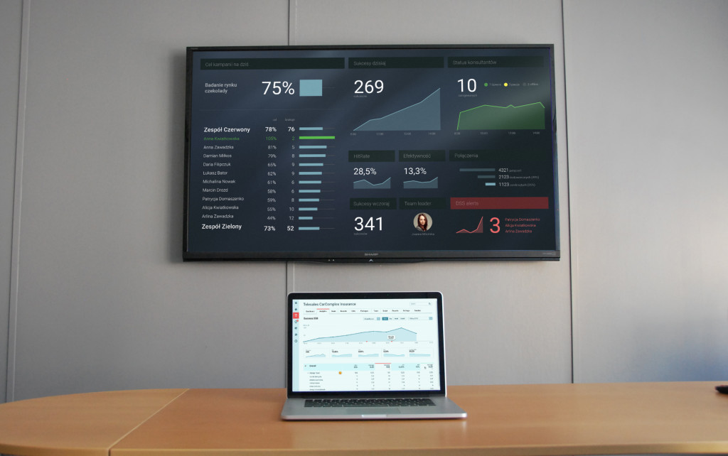
Wallboards
Wallboards for particular campaigns or teams were designed and developed. After observations, some changes were made to shown data.