Problem
BMETERS, an ambitious company, was held back by terrible and obsolete website with poor navigation and counterintuitive information architecture. With more than 50 products in five families and with absolutely separate target groups it struggled to provide basic information about the offer, not saying about technical data required by clients.
Solution
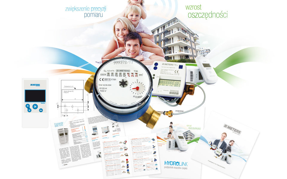
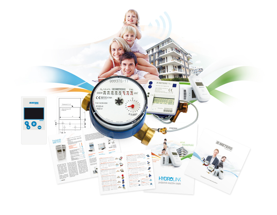
To meet business goals a website was designed as a first step. It provided clear products segmentation (and intuitive information architecture with easy navigation), gave civil engineers all required data and helped to build a brand image of a modern, tech company. The second step was to update all brochures and printed catalogues to make branding strategy coherent. The last step was polishing interfaces of desktop apps used to gathering data from water and heat meters.
Designer toolbox
Research
Design areas
Tools
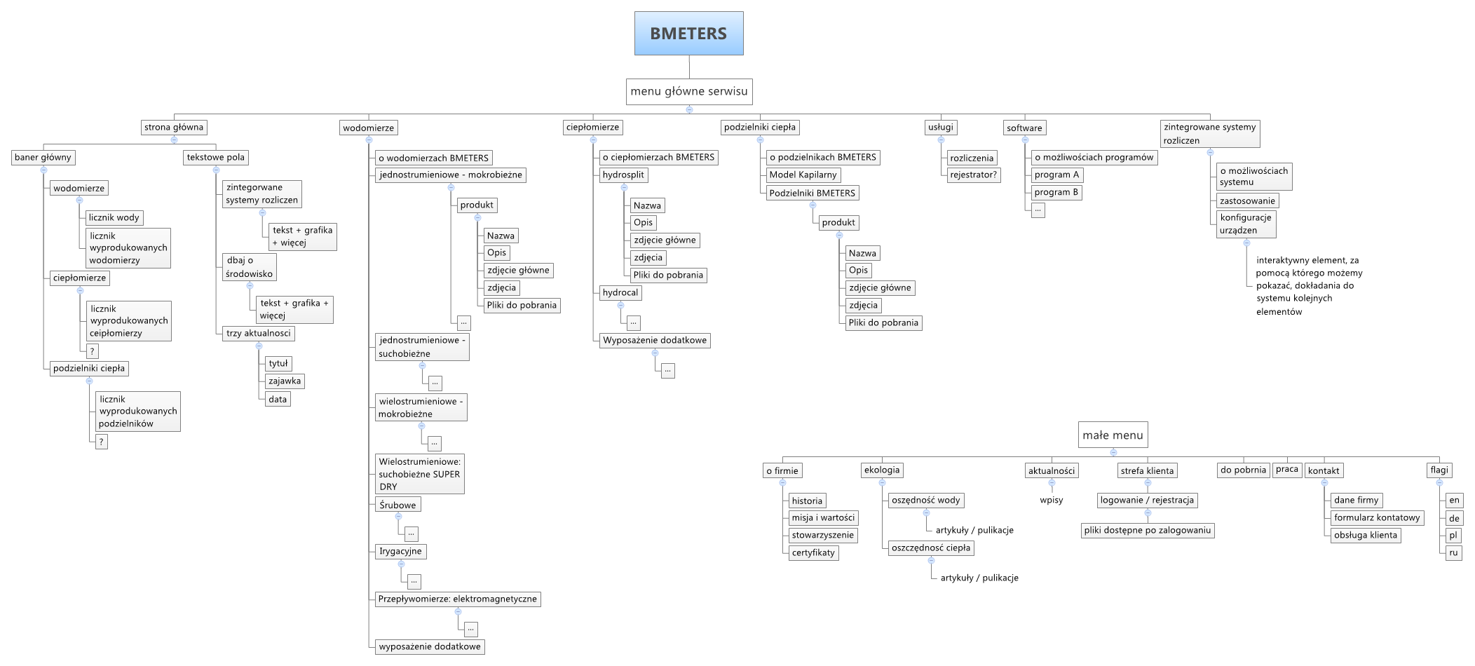
Navigation and information architecture for products
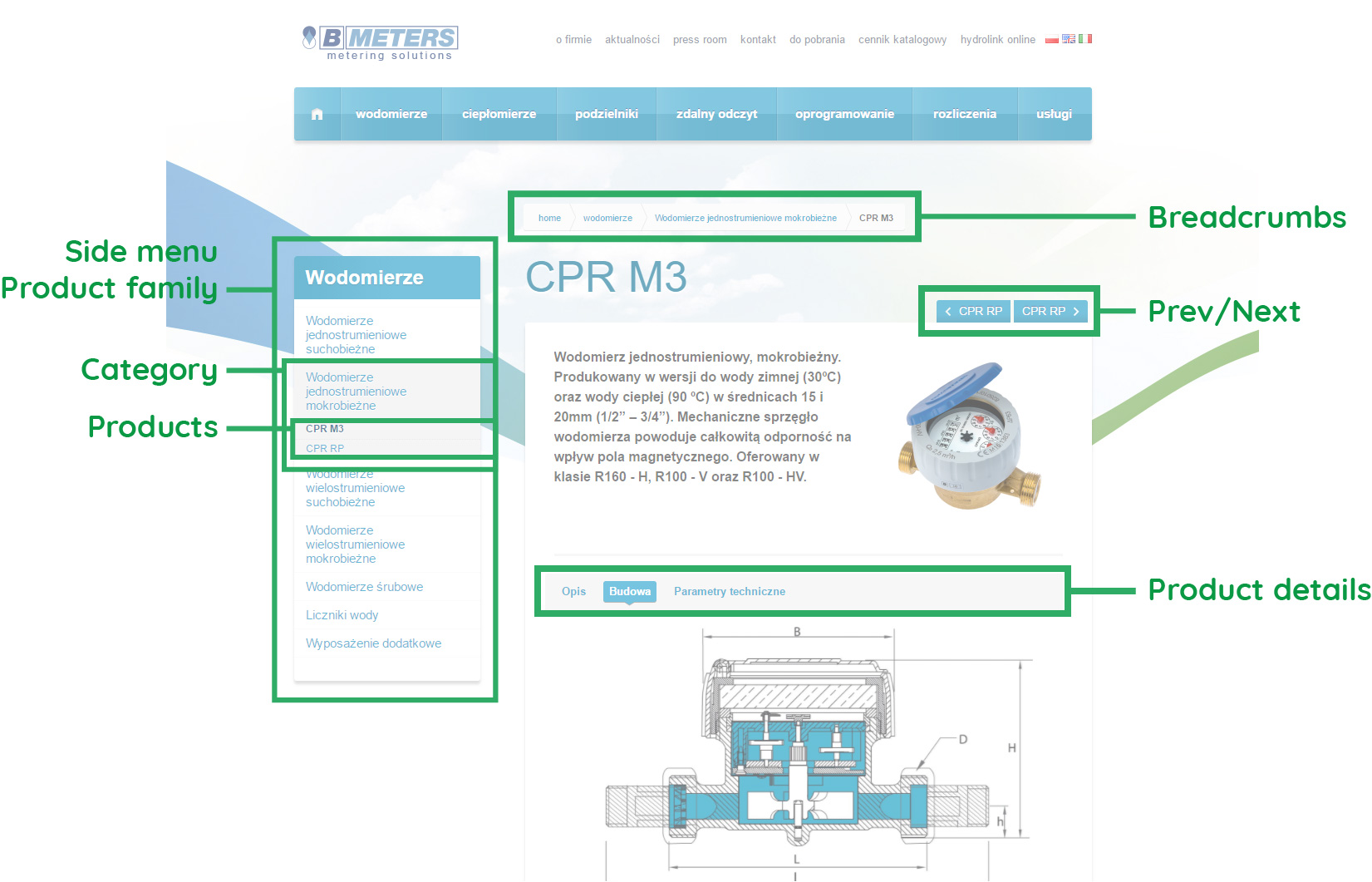
Designed information architecture reflected user needs and frequent questions. Products were divided into categories (users are familiar with meter types) and each was given a short description about key features and its designation. Details were cut into for pieces: a general description, construction details, parameters and downloads.
Navigation system allows users to navigate between products and shows system status.

