Problem
Even Manager Panel was made, call centre managers did not have an easy ability to access data instantly. Login in to an app on their computers was a serious restraint. Especially, they were not able to listen to their agents live or past calls without using a computer. And we all know that the best way of listening recordings is doing it with a smartphone.
Solution
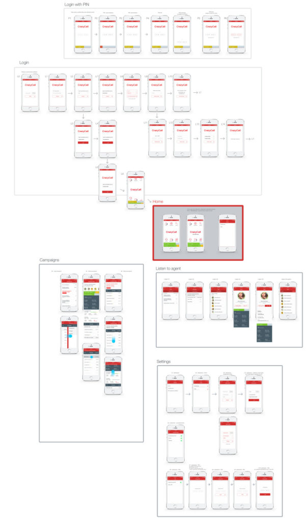
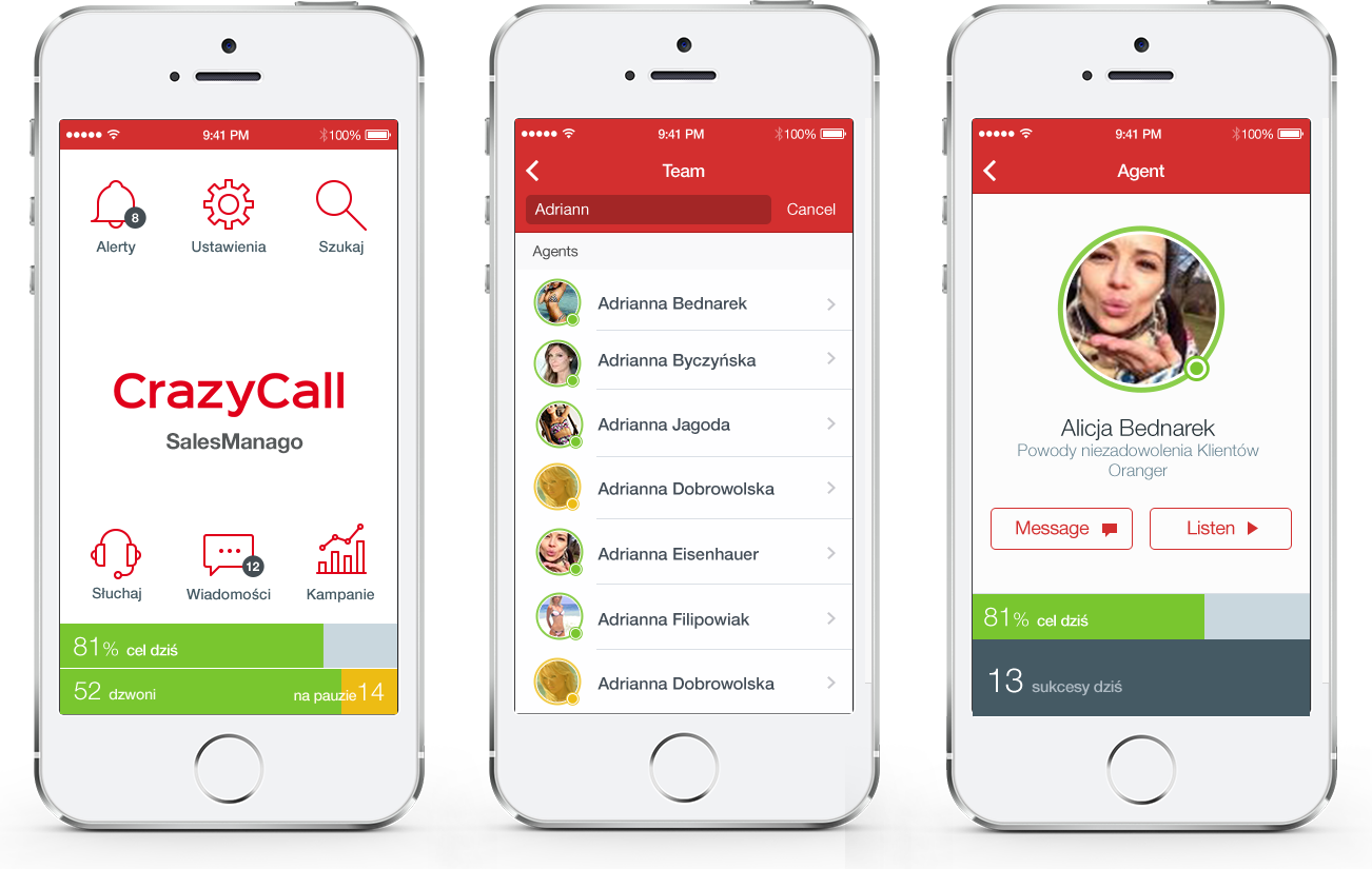
In order to give better supervision tool to call centre managers, the mobile app was designed. In a basic idea, it meant to be a simplified analytics with call listening. During the design process, some other functionalities came to our minds: messaging and whisper mode.
UX designer toolbox
Research
Design areas
Tools

Design process of mobile app
The whole team had a perfect knowledge of users goals, data and context. That made possible to skip the phase of emphasis and user research.
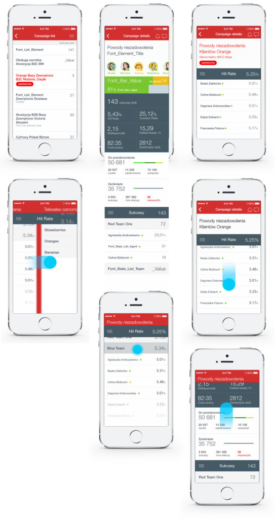
The key challenge here was to design a navigation system that would support deep information architecture (home > campaign > team > agent) and allow users to browse between entities easily (to make quick comparisons between agents, teams or campaigns). Since the navigation patterns are different on iOS and Android a decision with two separated designs was made. Andriod obviously built upon Google Material. A minor issue, but still important, was to create a compact analytic tool.
The design process started from selecting the most necessary data from Manager Panel and some short interviews with users (to get some better understanding about a frequency of actions or a time when information are needed). Benchmarking of apps built around data and charts had to be done, to give possible best experience.
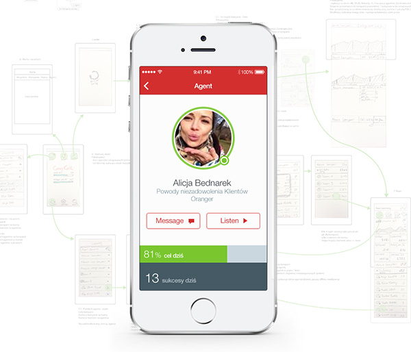
Paper prototyping and quick validation within the project team started. When general consensus about the scope was made then an analysis of feasibility with mobile developers started. With a green light for devs, the phase of pixel-perfect design part was done.
What went wrong: technical issues like serving data to mobile devices turned out to be a complex issue. Also, an upcoming pivot in company’s strategy and changing the target market put mobile app development on a side track. Android version was published only for a narrow group of user.
Two designs: iOS and Android
In most cases, it is a waste of time to design separate navigation systems for Android and iOS. But when we have to deal with a complex navigation and set of interactions which can work only on one device (like scrolling panels and sticky bars) it is good to consider building two separate apps. Each can be developed faster and is based on interactions familiar to users (no need of learning and based intuition).
