Problem
Agents in call centres are young people who have frustrated, hard work. Interfaces of existing solutions and tools are from the past decade or even century. Not user-friendly apps, harsh environment, goal-oriented job, fast pace of work and not necessarily pleasant people on the second end of the wire. The decision in CrazyCall was to make agents life better. Much better.
Solution
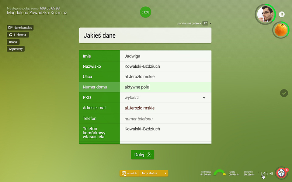
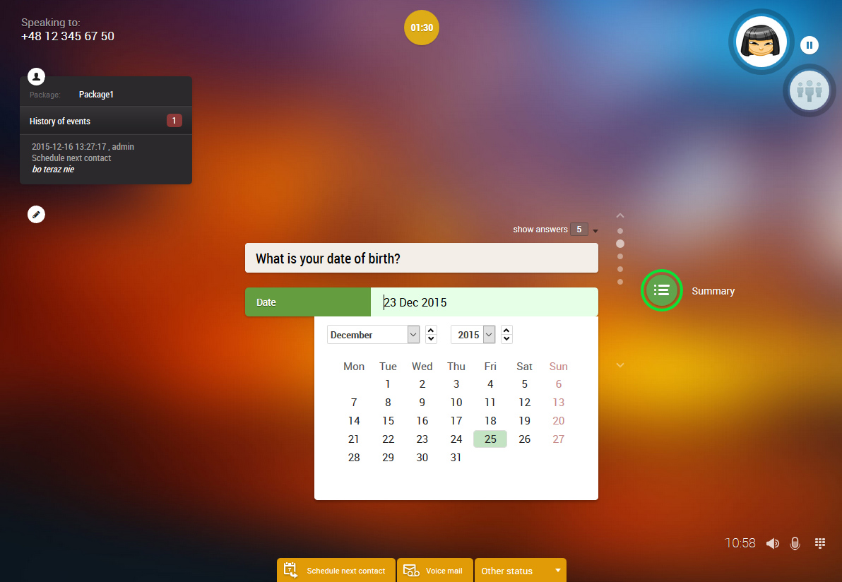
A modern interface, similar to one from tablets and mobiles, was designed to be an eye pleasing and to guide agents. Easy to learn, helping, efficient and fast. It was both an UX design and development challenge.
UX designer toolbox
Research
Design areas
Tools
Favorite tool
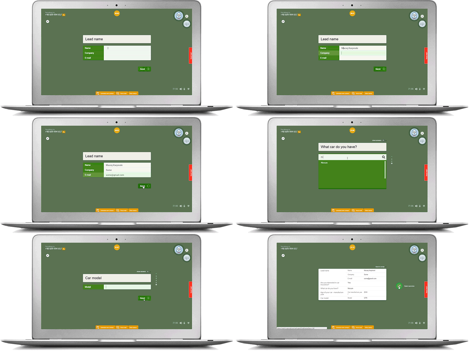
In CCIG (a call centre that initially tested CrazyCall) it was preferred tool for making calls by agents (9 of 10 agents who were using other software selected CrazyCall as preferred one). Call Panel finally scored overall 7/10 in NPS by agents (including newbies).
Objectives that were achieved
Design process
Hours of interviews, observations, tests and even working as an agent (and selling stuff) were behind this projects.

Many user flows, many sketches and wireframes
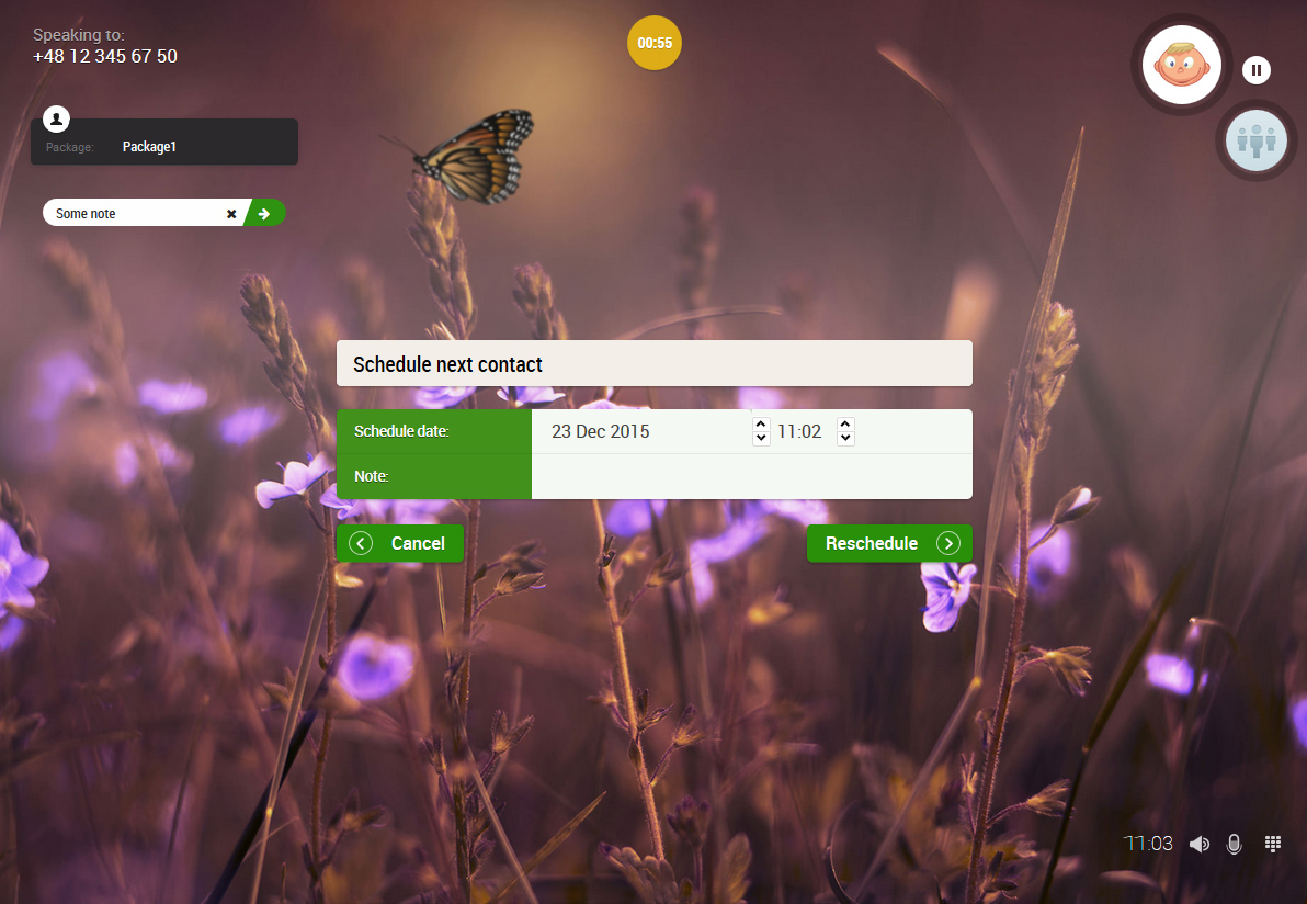
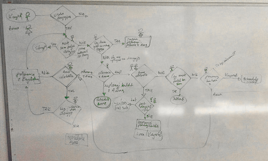
A call may go into a different way than closing a sale. Even a CallPanel seems to be a simple form it has multiple elements involving to scripting, scheduling or finding information about prospects. Sometimes is hard to decide what to do with a client.
As an example: On the left are possible actions an agent can take when speaking with an indecisive prospect and how Call Panel should guide him. Wireframes and first ideas for selecting another number associated with a company to call.
Lean UX design…
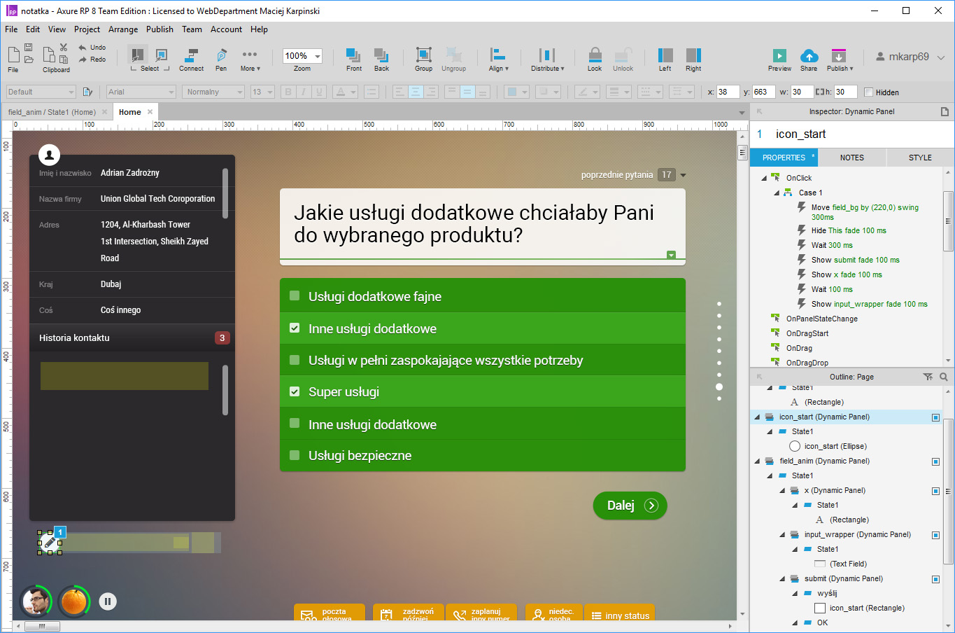
I used Lean Design approach to make quick and fast improvements. With high fidelity prototype (made in Axure due to complexity of user interface and tasks) I tested a couple of ideas with agents. 15 minuts of testing and half an hour of improvements in prototype… and again.
… is best for quick improvements of an existing app
It yielded with quick results and conclusions about designed ideas.
Multiple small interactions and tasks
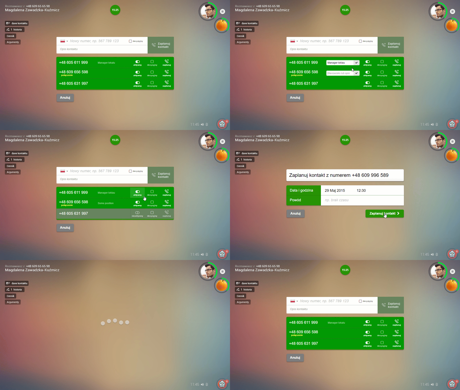
On the left is shown an example interactions. An agent can here manage call numbers of a prospect company. UI allows him/her adding a new phone number, activating/deactivating existing numbers, set the main number and scheduling a call.

